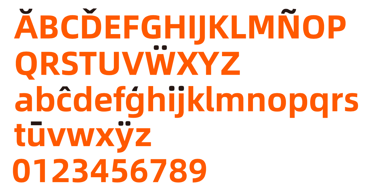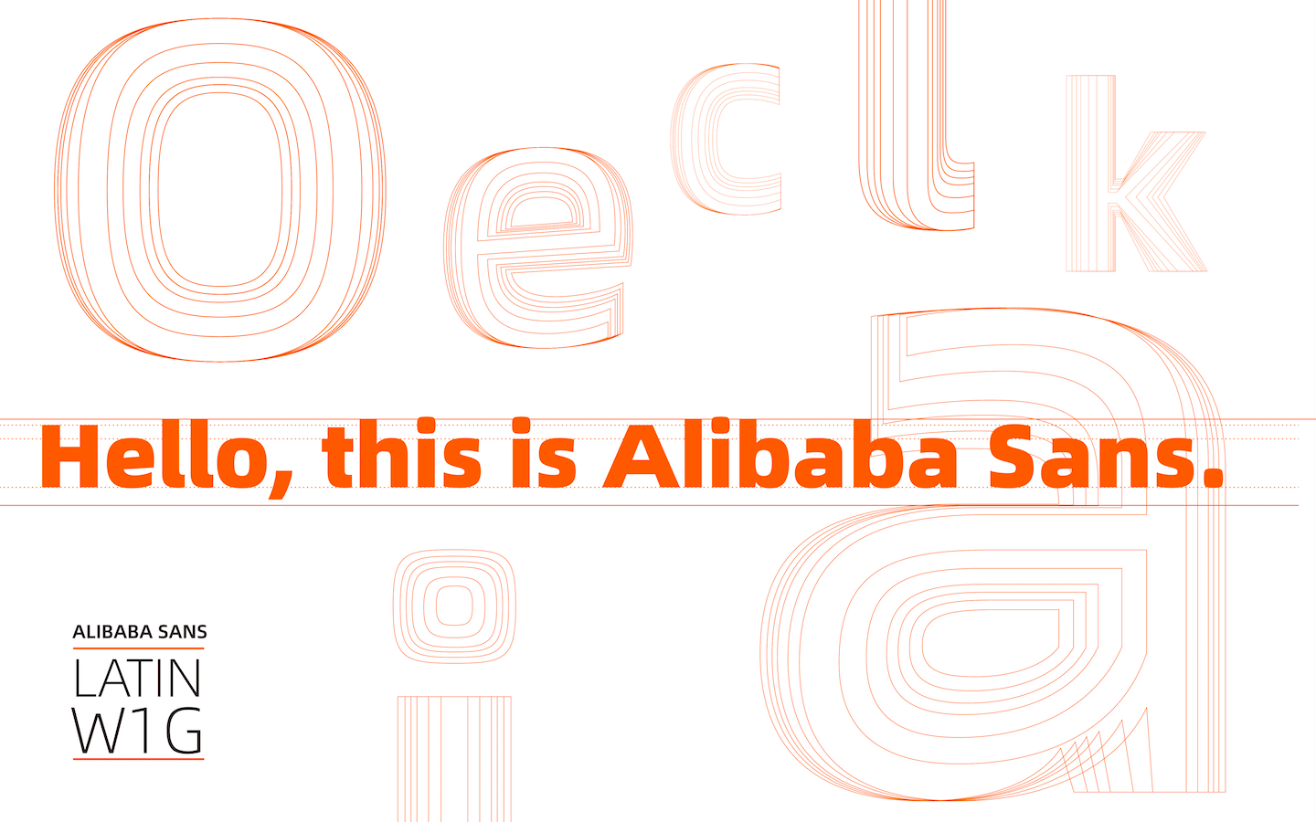
Alibaba Group is opening up its new custom typeface, “Alibaba Sans,” for all members of its ecosystem to use free of charge, the e-commerce giant said on Saturday.
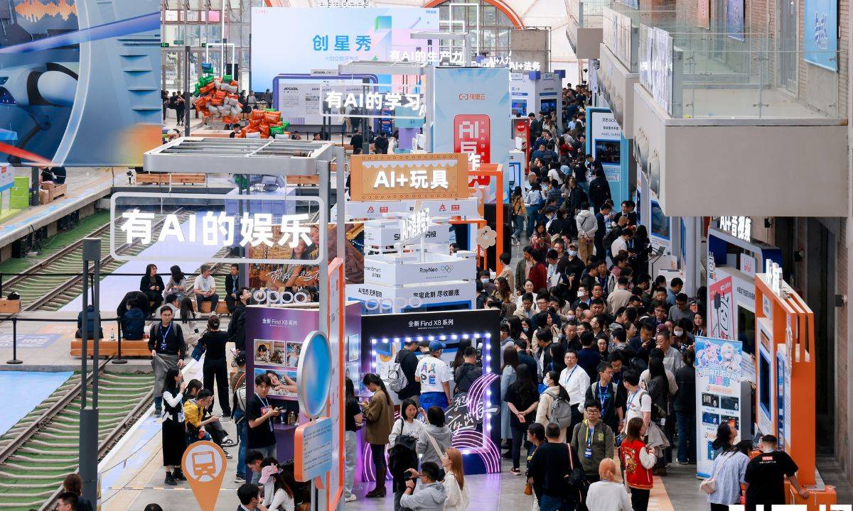
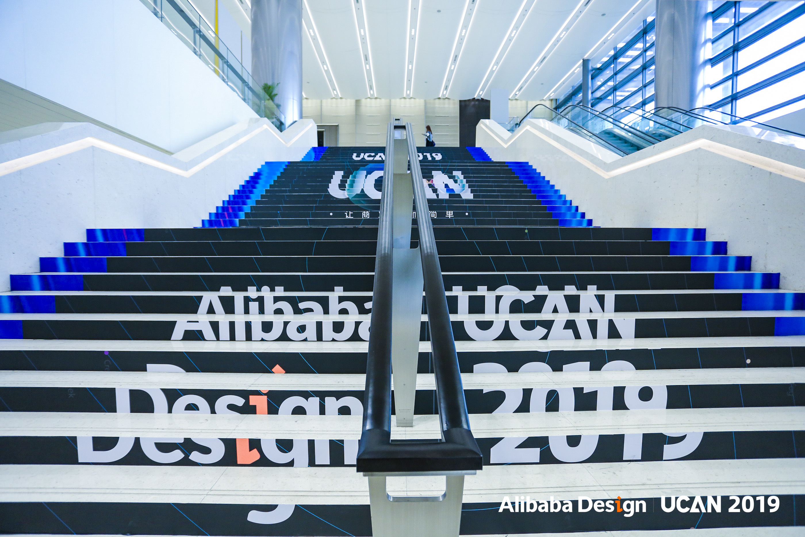
Partners, merchants and consumers on its platforms can download the bespoke typeface for both private and commercial use, the company announced, as it debuted the new font at its annual UCAN Design Conference in Hangzhou.
“We would like to make this new typeface an inclusive resource for all our partners and customers across the globe, and for free,” said Chris Tung, chief marketing officer of Alibaba Group. “True to our group mission, we are taking a concrete step forward to helping small- and medium-sized enterprises to participate in the digital economy through the power of design.”
The move is in line with Alibaba’s latest push to enable merchants in digital marketing and design. Last year, it released several tech-driven solutions that help free up creatives from repetitive, low-value tasks to focus on more meaningful work, such as a video-editing tool that can make short videos out of text and images in less than a minute and an artificial intelligence-powered copywriter, which learns from millions of top-quality existing samples to generate copy ideas for merchants.
Alibaba Sans would also help establish a common visual identity across the company’s versatile and rapidly evolving business landscape, said Yang Guang, senior director of Alibaba New Retail Design. At the pace that the company is expanding into new areas and new geographies, it becomes “all the more important to have an official typeface that not only ensures branding consistency, but also helps people learn about Alibaba,” he said.
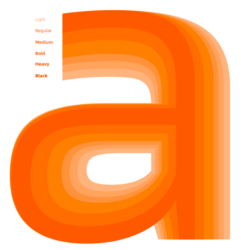
Partnering with U.S. typeface company Monotype, Alibaba began creating Alibaba Sans last June with a wide range of applications in mind, seeking to reflect all possible touch points in its vast ecosystem. The result was a font that is highly legible on small screens for the shoppers using its e-commerce apps, such as Taobao or Tmall, while remaining pleasing to the eye when stretched out across office buildings. Alibaba Sans covers 172 languages, with plans to expand to more, and supports two styles and 11 weights, which can stylize the font into the best visual effect for important events, such as the 11.11 Global Shopping Festival, and international collaborations, such as the Olympic Games.
“Alibaba Group faced a common but significant branding challenge in that it needed to convey its brand values across a wide range of environments, both physically and digitally,” said Monotype’s Akira Kobayashi, the lead type designer for Alibaba Sans.
“It was a pleasure to work with a team so dedicated to the importance of type, and help Alibaba Group realize the potential that a custom typeface has for unifying a brand,” he said.
Capturing Company Culture in Type
Japan-born, Germany-based Kobayashi previously led the design of Sony’s corporate typeface, SST, which has since been used across the Japanese electronics company, from its website, product interfaces and packaging to price tags and user manuals.
Alibaba found him to be second-to-none choice to oversee the design, as Kobayashi “not only had extensive experience in crafting Western typography for corporations, but also has cross-cultural sensitivities and familiarity with Asian culture. This made it easy to communicate our values as a culturally dynamic company,” said Chiang-Hui Lin, head of corporate branding at Alibaba Group.
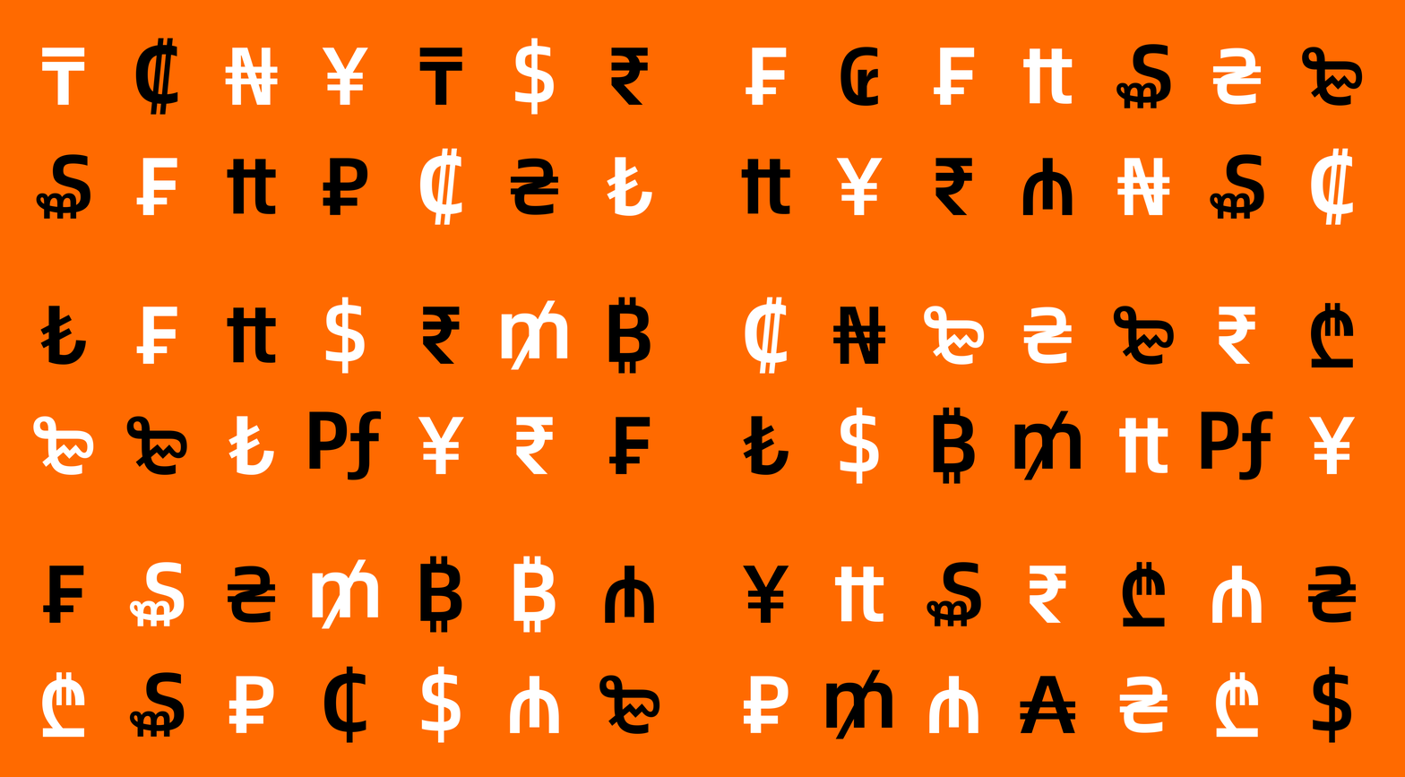
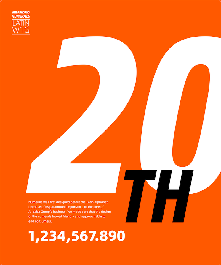
Alibaba and Kobayashi took an unconventional approach to the design process: They started with numbers, rather than the Latin characters. Alibaba’s core business is centered around commerce, so it was paramount to make the numerical designs and currency symbols look “friendly and approachable” for consumers, Lin said. Kobayashi also began by crafting fonts for small screens, as most users access Alibaba’s platforms via smartphones.
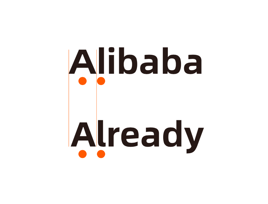
Alibaba surveyed its employees around the world to pin down nine keywords that characterized Alibaba, which shaped the entire design process: dynamic, variable, young, passionate, bold, powerful, future, innovation and technology.
“Brand personality is a very personal feeling, but the way we summarized it to Mr. Kobayashi was to see Alibaba as a 20-year-old, who’s young and bristling with energy,” said Lin, adding that the personality of Alibaba Sans font is reliable, but energetic and young but levelheaded.
That can be felt when words are typed out via Alibaba Sans, Lin explained. The “baseline” or bottom half of the words tend to be sturdy, while the upper half is rounder and more rythmic. It’s the combination of two extremes. It tells readers, “I’m grounded, but also dynamic,” he said.
Download the Alibaba Sans typeface here and Alibaba PuHuiti here — the font’s Chinese counterpart, designed in collaboration with Hanyi Font. PuHuiti was also released as part of Alibaba’s new font family.
